Productivity has become a buzzword, something everyone ought to strive for. At the same time, burnout is on the rise globally [1]. So how can we make sure we accomplish our tasks and achieve our dreams in a way that nourishes us rather than burns us out?
With that question in mind, I was approached by an existing client to work on a digital product and a coaching program that she had designed. She knew the program’s potential and wanted to communicate it in a clear and memorable way that would expand its reach and impact.
This project included:
Marina Romashko is a 2x entrepreneur, productivity coach, energy healer and mindfulness teacher. For the last 20 years, she has worked in business coaching and project management for Fortune 500 companies.
Marina is a founder of the Big Idea Lab (BIL), a consulting company that provides productivity, spirituality, and mindfulness services to individuals who want to align with their highest potential.
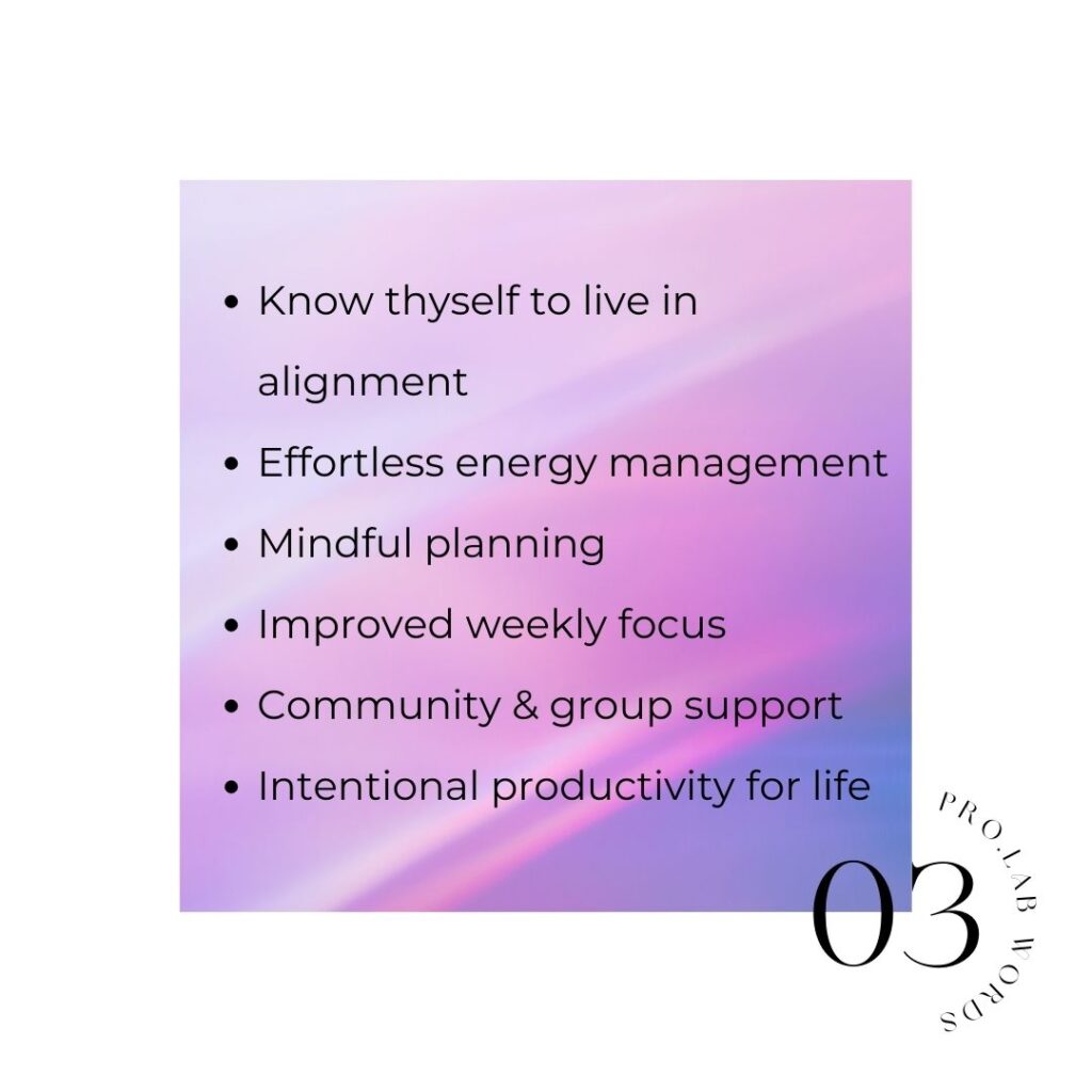
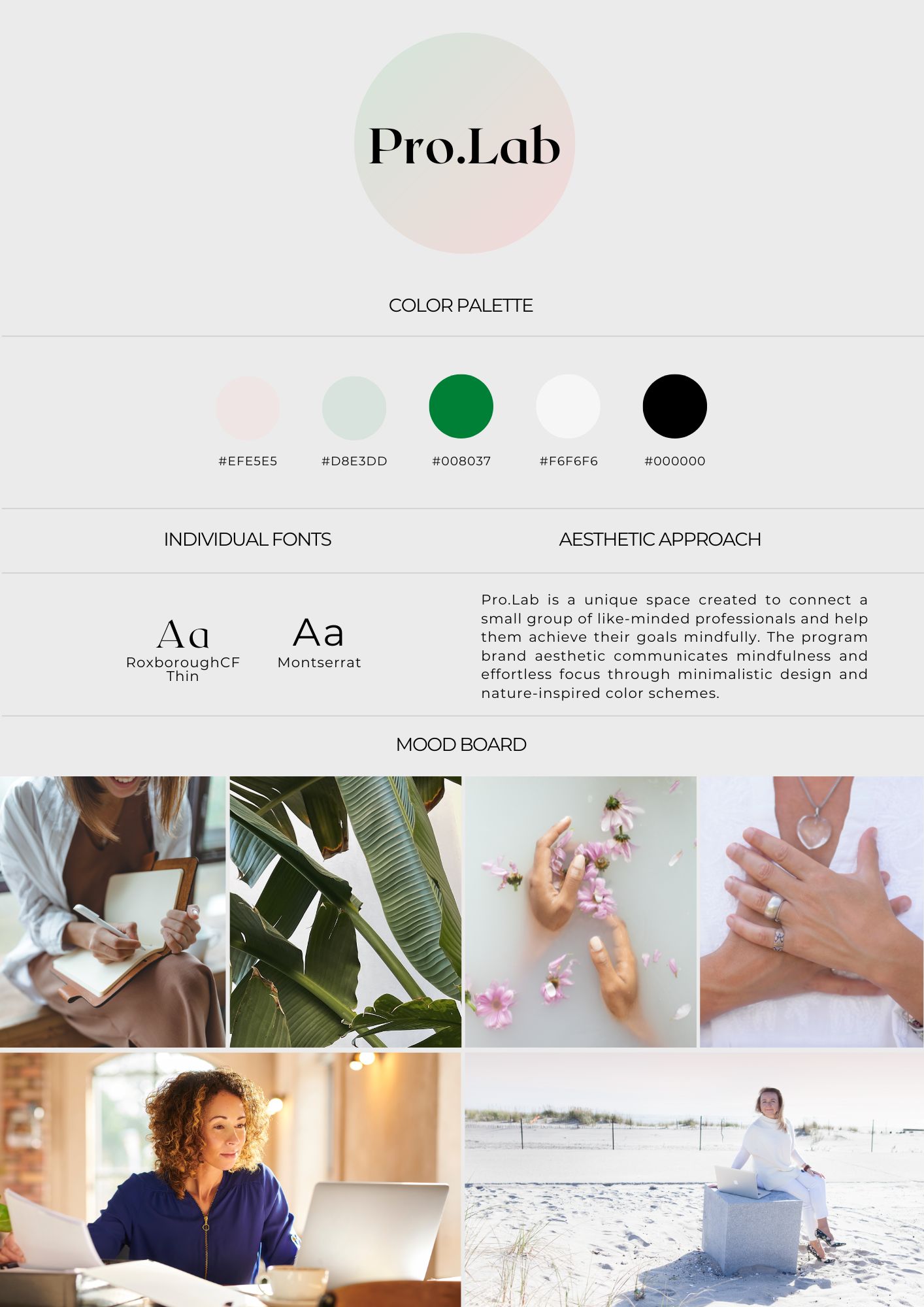
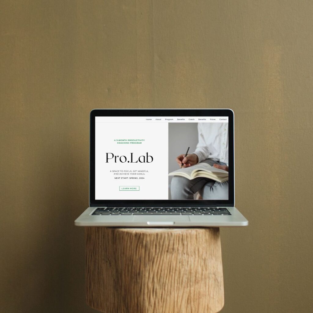
The founder of the Big Idea Lab approached me with a productivity coaching program she had developed and ran, which she wanted to turn into a standalone product. The client’s main request was to design a landing page for the program and supplement it with marketing materials in order to promote the next program launch. While the landing page was the largest deliverable that needed to be created, more needed to be done to turn the program into a full-rounded brand and expand its impact. That’s why I proposed to the client to focus on brand development first.
We had a month before the next launch of the program and even though the client had her preferences and wishes, she gave me full creative freedom to develop the brand.
In the first phase, I learned more about the program, its content and objectives, and studied customer feedback. I then conducted market research and put together a brief SWOT analysis of the program.
After the information was collected and analyzed, it was time to develop the brand. We started with naming. The program was called Productivity Lab before, but it was important to make it more catchy. In the end, after trying a few things, I decided to connect the words ‘productivity’ and ‘professional’ while also maintaining the original idea of a laboratory. The final name got to be Pro.Lab.
Next, the visual identity was developed. It needed to communicate the program’s message of ‘slow down to achieve more’ and resonate with the target audience – established, busy professionals aged 40 to 60 who want clarity and simplicity, but also want to see results. I decided to go with pastel green, pink and gray colors while adding a contrasting bright green for accents.
Typography plays an important role in the development of visual identity. Knowing our target audience and the essence of the program, RoxboroughCF Thin was picked as a title font, while Montserrat was a body font of choice.
The program’s visual identity needed to communicate the program’s message of ‘slow down to achieve more’ and resonate with the target audience – established, busy professionals aged 40 to 60 who want clarity and simplicity, but also want to see results.
The next phase was about launching the brand digitally and to do this we needed to create digital assets and, most importantly, a landing page. I focused on creating a convincing narrative that would not be overburdened with design or visual elements. Clean, coherent, and realistic visual elements were chosen to accompany the copy. The page was divided in clear, comprehensible blocks that provided all necessary information to the potential customer. The copy was SEO optimized.
Clean, coherent, and realistic visual elements were chosen to accompany the copy.
The landing page was supplemented by the digital assets that the client used to promote the product and run a successful launch. They included social media post and reels designs and copy. Additionally, other deliverables were designed and developed that the client used during the program as handouts and program resources.